Headspace.
Feature addition to an existing app
Customise your meditation journey.
Headspace offers inspiration, guidance and support to living a mindful life, in the form of guided meditations, animations, videos and more. So far, the app has been downloaded more 70 million times in 190 countries. It has over 2 million paid subscribers and more than 600 businesses are using Headspace’s on-the-job mental wellness tool.
Project Type: Adding a new feature to existing app
Duration: Jul - Aug, 2021
Role: UX Research, UX Design, UI Design
Tools: Figma, Miro, Maze, Notion
The Challenge
There are more than 2,500 meditation apps. The coronavirus pandemic has led to a surge in downloads of mental wellness, and specifically, those focused on meditation, dealing with anxiety and helping users fall asleep. The obsession with wellness and self-care created a “mindful competition”.
How can Headspace keep people coming back to their service?
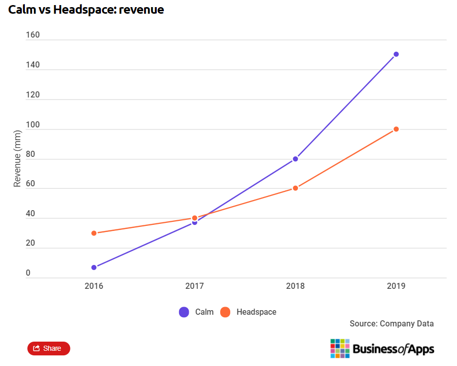
April 2020’s top performers by downloads were dominated by meditation apps, with Headspace, Calm and Fabulous being the top 3 in Great Britain. Headspace was ranked second in overall revenue among the top-grossing health and fitness apps worldwide.
The Solution
The design will be focused on adding a feature to the Android app version and will remain within the current app structure, look and feel and currently available content. The solution will aim to increase product value, create more engagement and improve user retention.
Research
As a paying member of the app, I had a list of features I could potentially add but had to remind myself that I am not the user. My initial task was to assess and define the user’s problem in order to design a solution that will be the best way forward for the user and the business. This will be determined by conducting early user research.
Hypotheses
We believe that giving users more control over the content they consume will create more engagement with the app and improve user retention.
Methodologies
I’ve started with Secondary Research, to learn about the company and industry and gathered existing data from google play reviews and Facebook. I’ve conducted a Competitive Analysis to Identify trends and patterns as well as gaps. And finally, engaged with the active Headspace community on Facebook to further support my findings.
Competitive Analysis
I have downloaded and analysed the features and offerings of the three top meditations apps users mentioned they use alongside Headspace. I’ve noticed that there is a clear difference. Compared to other apps, Headspace does not provide users with the option to control and customise the way they use the app.
Empathy Research Insights
I have analysed the comments from Google Play as well as the Headspace Facebook community to find out what are the most common issues and pain points users report having, that I can solve by adding a new feature.
Ability to download content - not everything is downloadable. Users want to be able to listen or watch the content when they are offline, on a plane or when they simply want to disconnect from the world.
Sharing - Users wanted to share meditation they liked with others
Queuing option - Users wanted to create a queue so they can listen to content without reaching their phone again to select the next meditation.
Meditation method - Not knowing what method the meditation will use - Body scan, visualization, noting etc.
Fast-forward option - Users accidentally hit the back button or exit ap and want to go back to where they’ve been.
Feature Prioritisation
There were few opportunities I could identify for the app, but in this project, I will be focusing on the top two. I have listed the features and functionalities and prioritised them. These will normally go to the product backlog, get priorities and be added into sprints.
Define
Now that I understand a little bit more about the market and the customers and have identified some opportunities for my redesign, it is time to clarify and define the areas of focus. The details of what will be designed, for whom, and how.
From the research, I understood that a lot of users can benefit from an option to create playlists, so they can decide what meditations they listen to and in what order. The research confirmed my hypotheses that users need more control and focusing the new feature on creating playlists could add value to users and increase their engagement with the app.
I’ve also decided to added additional options that came up from the research insights to the meditation options menu: Download, Share and Transcript, as well as the option to fast-forward and backwards in the player.
User Persona
A lot of the users mentioned they started using the app for stress and anxiety and a lot of them shared the same goals and motivation…. This is how I created Grace - the user persona I’m going to use to guide my designs.
Application Sitemap
I’ve mapped the Headspace Android App to show the current app structure and added two options for a potential location of the additional feature.
I’ve decided to run a quick test to find out where will it make more sense for users to look for the Playlist option. As I’ve seen three’s three possibilities I wanted to approach the users through Facebook and find out rather than decide based on my assumptions.
I found that option B - A dedicated button for the playlist in the ‘Today’ tab will be welcomed by 95% of the users as it’s quick and easy to find.
Task Flow
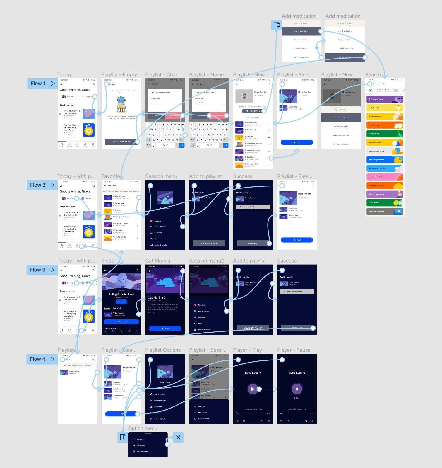
The main task I’ll be focused on in my design is creating a new playlist and adding content to it. I’ve created a simple task flow to help me design the screens I need in order to achieve the task..
Design
With a clearer idea of who the user is, what task to design for and how the app content should be organised, I could start sketching some ideas (with pen and paper).
For this project, I decided to skip the wireframing stage and instead collected screenshots from the app and spent more effort on replicating existing design and branding to provide the user with an experience of the real app when going to the usability testing. My sketches were simple and clear enough to go straight to Hi-Fidelity design - I wanted the experience to be as simple and sleek as possible.
High-Fidelity Design
These are the screes that a user will go through when creating a new playlist. I have ensured the experience matches the current android design patterns of the Headspace App.
Here’s another example for adding a session to the playlist, this time from the Sleep menu. You can see the options menu that users will get for each session and the options for the playlist they’ve created.
During the design stage I’ve iterated few times on the UI elements and asked for feedback from other designers and my mentor as it is important to have other designers look at your work rather then work in silo - it’s also makes your product better as having a team full of ideas and insights always add more value to your work and learning.
Earlier Player designs
I’ve added the buttons to the side of the main ‘Play/Pause’ button and as it didn’t fit the overall simple Headspace design I’ve moved these controls to the bottom.
Final player design
Bottom-aligned controls worked better as they are closer to the time bar and as Headspace also has videos this positioning is compatible with a video player. I’ve also decided to limit the controls that allow the user to fast farward or backwards to ten seconds, so the user won’t skip the location entirely.
Prototype and Test
I’ve created a prototype, in Figma, and put together a usability test plan to test the below tasks with users:
Creating a new playlist
Adding content to playlist from Favourites and from another menu (i.e. Sleep)
Playlist options and Reordering sessions
Listening to playlist
Usability Testing
I’ve used Maze when I went to test the app with users and got seven testers to test my design. One had never used Headspace before. The users I’ve tested with were not part of my research.
“Creating a playlist was straightforward and aligned with how I create playlists in other products”
Findings
All users completed the tasks successfully and I got a positive response for the playlist feature. Users felt that this feature integrated well with the Headspace app and one commented that it felt like a legit Headspace feature.
There was one thing that came up in the usability tests that was related to reorganising the sessions within the playlists. I’ve designed it to be used with a menu to keep it aligned with the current app behaviour, however a couple of users said they expected it to be ‘drag and drop’ rather than a menu.
Next Steps
For this project, my next steps will be to learn how to create ‘drag and drop’ and ‘swipe to delete’ in Figma so I can use these in my next projects when I need to create a prototype and test with users.
If I had more time I would want to test my design with more users to gather more data and ensure there’s nothing else that might need to be fixed in the next iteration.
Reflection
This project was very close to my heart as I use Headspace on a daily basis. When I first decided to do my project on the Headspace app I thought I would be creating a new profile page and work on tracking progress. However, from my research I found out that most people don’t even think about tracking as much as I do. A lot of the users think the app in it’s current for is cluttered and I tried to ensure my design of the playlist feature will be as simple as possible with very little change to the ‘look and feel’.
I learned that sometimes you don’t get much feedback or feedback you can use when you test with a small number of users. However, from the positive response I got, this might not be an issue at all.
Researching and learning about design pattern and why different elements of UI are done in one way and not another has been very interesting and I hope I’ll get to learn about it more in my next projects. Without my peers help I might won’t ask myself these questions, therefore I really think it’s important to get feedback and work with a team of designers.
Overall, I enjoyed working on the Headspace app and hope to see them add the option to create playlists. I know I’ll use them, especially at night.


