HOPPA.
Designing the future of time travel experiences
The human race has been dreaming about time travel for ages. Now it’s finally possible!
HOPPA is a (Fictional) time travel tourism company, helping adventurous travellers to search and book time travel experiences. Their mission is to create a world where people can safely explore and enjoy the past.
I worked on designing their new brand and booking process.
Project Type: Responsive Design
Duration: Feb - Mar, 2021
Role: UX Research, UX and UI Design, Branding
Tools: Figma, OptimalSort, Miro, Maze, Zoom
Challenge
HOPPA is a new tourism company, the first of its kind, that is able to offer safe time travel experiences to the general public. The challenge is to identify and understand our target users, build a trusted brand and make the booking process as simple as possible.
How might we help users learn about time travel, find the right adventure for them and book the experience with ease?
Solution
Design a responsive e-commerce website that sells travel packages to different experiences in the past. The website allows easy navigation and uses familiar patterns for a smooth booking process.
Design Process
For this project I have followed the design thinking process and created the following deliverables.
Empathize
The purpose of this phase is to conduct research in order to understand the travel industry as well as to understand and empathize with our potential user’s needs, behaviours and concerns. See my research plan.
Research Goals
Identify and understand the current travelling industry: current state of the market, competitors, statistics and demographics.
Identify and understand the potential target users, their expectations, needs and challenges when searching and booking holidays.
Identify and understand user motivations, interests and concerns. Get insight into user experience and behaviour with ancillary travel sites.
Assumptions
HOPPA will attract only high-income customers
HOPPA will have significant growing pains
Potential users will have fears and concerns about time traveling
Methodologies
MARKET RESEARCH
The aim of the market research was to gather information about trends from articles and reports on the travelling industry. As time travelling companies do not exist, I looked into Adventure Tourism. The findings provided in-depth insight into the potential target users’ characteristics as well as how the website and booking process should be designed and what features are important to include.
COMPETITIVE ANALYSIS
Understand the current experiences the travelling industry offer, explore their website’s design and usability, and identify any interface patterns. I have analysed five direct and indirect competitors to identify their strengths and weaknesses.
USER INTERVIEWS
I have conducted 1-on-1 interviews with potential users, based on a script I have prepared, in order to gain an understanding of their travelling habits, needs, motivations, decision-making process, and frustrations, as well as their attitude towards the concept of time travel.
Eight participants between the age of 35 - 54 had been interviewed, all have experience with booking trips online, and are travelling for holidays between 1-3 times a year.
“I don’t like to just stay in a hotel on the beach, the location has to introduce opportunities to experience culture, nature, and history.”
Insights
Drive: More than ever, people want to see the outside world and the motivations vary.
There is a real thirst for travel - to see more, do more, experience more. Travel became fundamental.Booking Process: Finding the perfect destination, flights, accommodations, and activities is a time-consuming task for most people. The process involves a lot of research and going through reviews from other travellers.
Budget: No matter what age or income, most travellers want to know they get the best deal they can. They prefer websites that allow them to compare and offer competitive prices.
Reviews: User-generated content and social media have a big impact on how people explore new places and plan a trip. Blogs, Vlogs, Instagram account with stunning pictures help people make better decisions.
After synthesizing my research findings, I have created a User Persona that represents the type of audience we are targeting.
User Persona
From my research findings I’ve created a user persona and an Empathy map to guide me for designing the experience for the persona I’ve defined.
Define
The purpose of this phase is to clarify and define the details of what will be created, for whom, and how. I have then captured the UI requirements which will be the basis for my design.
Opportunities to explore
From the research phase, I have identified the below opportunities for the solution:
Convenience - When you book a packaged tour, someone else handles all the details. You just need to choose, pay and let a professional deal with transport, guides, and hotels. All you need to do is arrive at your departure point on time.
Worry-free travel - A stress-free travel experience.
Cost - Package prices will include travel logistics, accommodation, meals, and guides.
Access to unusual destinations - Unique, culturally authentic locations, most people can’t reach on their own. Maximize your sightseeing value by travelling with a local knowledgeable guide.
Learning experiences - Discover cultures, learn new skills, and study the subjects you have always wanted to know about.
Social opportunities - Meet new like-minded people.
Product Goals
In order to define and prioritise the features that will be included in the website, I used a diagram to have a visual overview of business and user goals and their shared goals, as well as technical considerations.
Card Sorting
In order to find out how users understand and categorise historical events, I have used an Open Card Sorting research technique. Providing participants with 30 different time periods and events cards to sort and label as they understand. Analysing the results will help to organize the website in a way that will be easy for the user to search for an experience.
Findings
Grouping: Most participants used historical timelines and activity types (i.e. Sport, Entertainment) to label the groups they’ve created.
Agreement: After Standardizing the results, we found that the areas the participants agreed on the most are: Prehistoric, Entertainment, and Architecture.
Repetition: The most repeated words were: Ancient, Entertainment, Time, History, Sports and World.
Struggle: Some cards appeared in 6 different categories and show that participants struggled with deciding where they belong to.
Site Map
Based on the card sorting results, I have created a sitemap to show how the site will be organized and how similar information will be grouped and categorized.
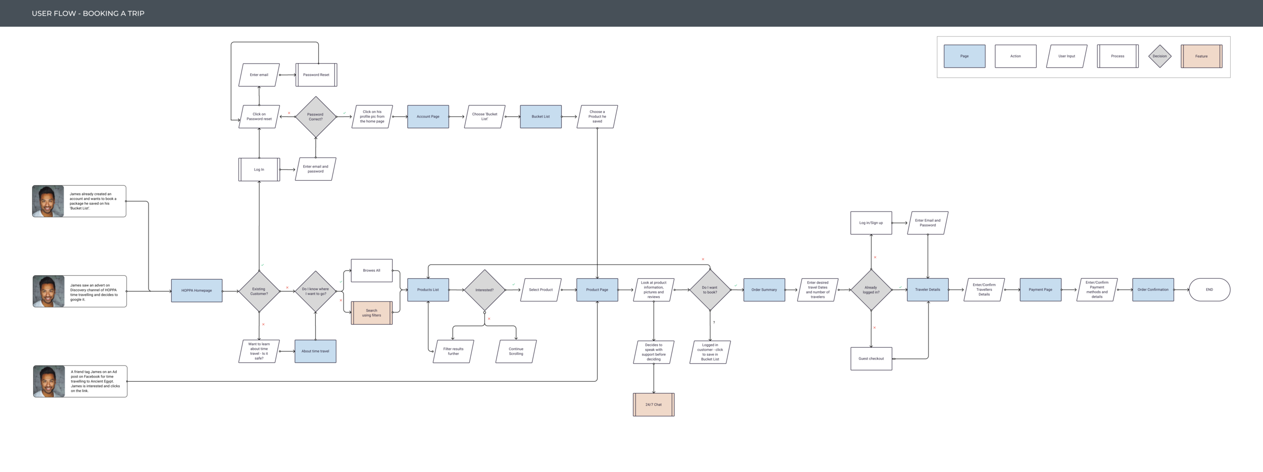
User Task Flow
I have defined the main task and created a user task flow, that shows the different paths and decision points my user persona might choose to take when booking a time travel experience:
Users explore the site, click on about to learn more about time travel
Users want to chat with support and use the 24/7 chat feature before booking
Existing users save experiences to his bucket list
Ideate
Once I had a clearer sense of what sort of functionality and features I wanted to include, I started sketching few design ideas and moved on to create the wireframes in Figma.
Wireframes
Starting with mid-fidelity wireframes for desktop, made more sense, as I found out that most users prefer to complete their travel booking using their computers. I have also designed responsive wireframes for tablet and phone sizes. After all, we all use our mobile devices on a daily basis, and users will be searching and reading details on the go.
Brand Identity and User Interface
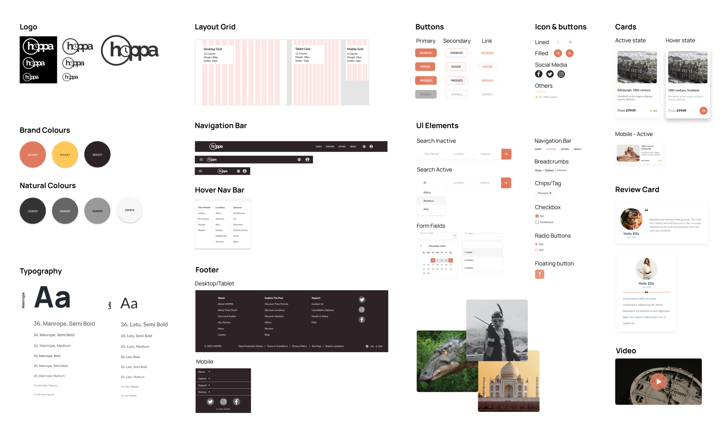
In order to create the brand identity for HOPPA, I’ve collected inspiration and ideas on a mood board and sketched few options for the logo. I have analysed the design patterns similar websites use and created a style guide including typography, colours, and the different UI elements.
Responsive design
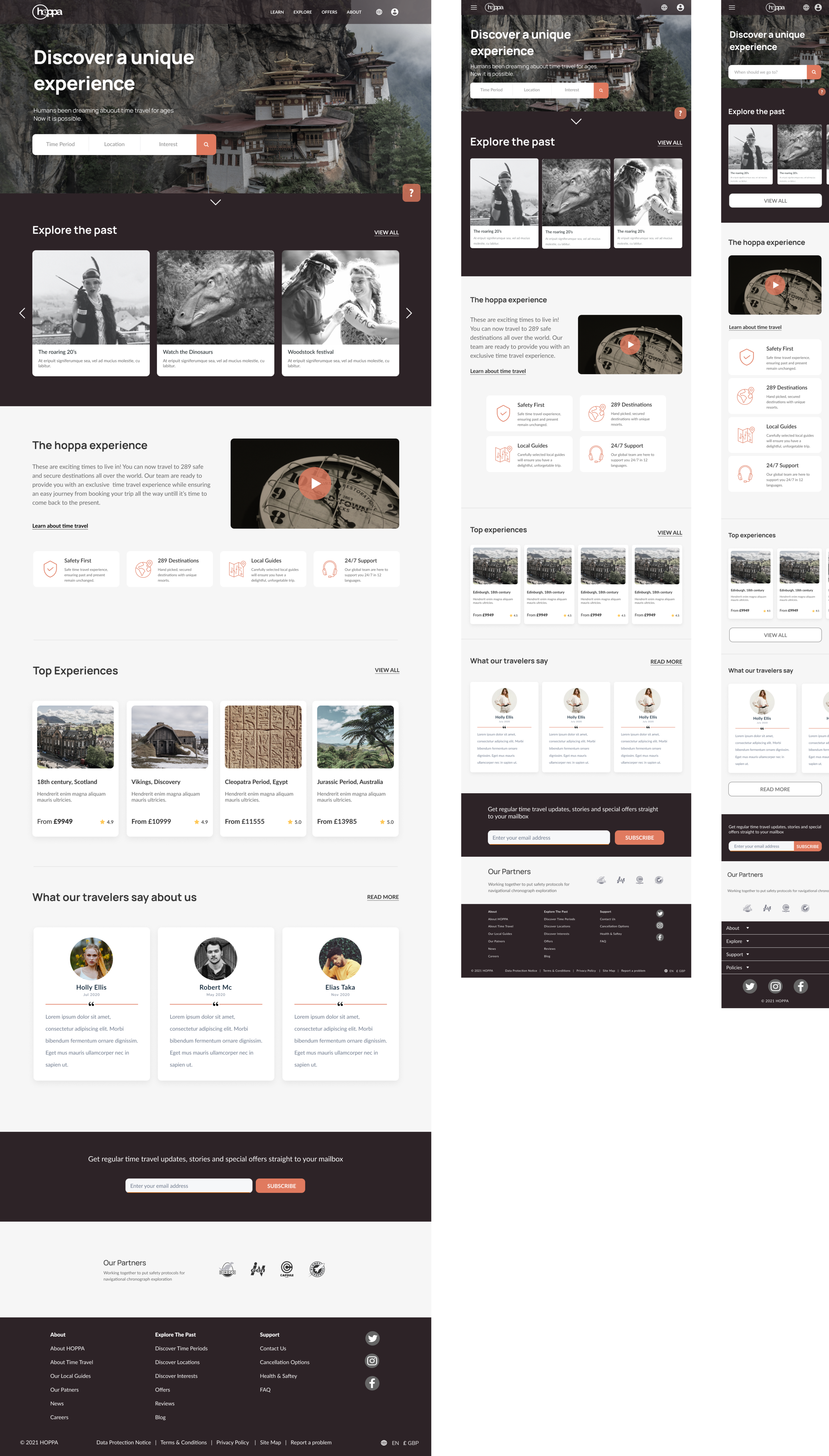
Using Hoppa’s branding and UI guidelines. I’ve designed a homepage for Desktop, Tablet and Mobile.
As you can see below the design uses a different layout especially seen in desktop vs. mobile design - grid, image and text size, navigation bar and more.
Prototype
To validate my design I have created an interactive High fidelity prototype and put together a usability test plan to test the booking flow with users.
After designing the website screens, I have created an interactive Prototype. The prototype has limited functionality to allow testing for my persona’s main task: Booking a time travel experience.
High-Fidelity UI Design
Below you can see my designs for the Homepage, Products list and Product page screens that are part of the user flow for booking an experience. I have based the structure and content that are included in the screens on the insights from the user research and used the design patterns that I identified from looking at similar websites. I’ve also ensured I work with the branding style I’ve defined for Hoppa.
Test
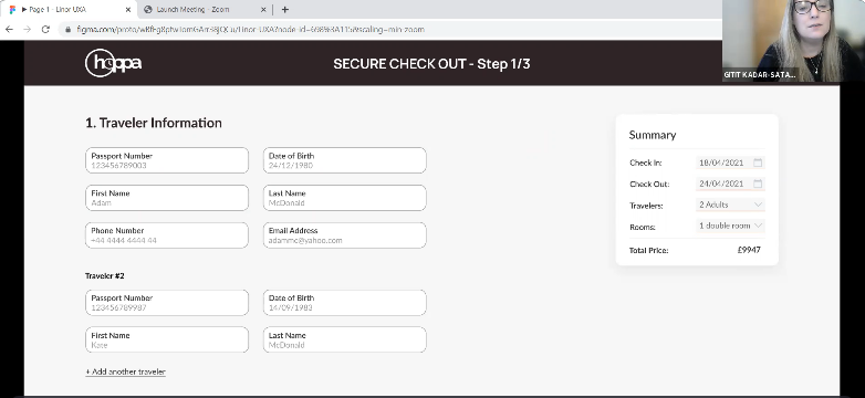
I have conducted ten usability test sessions with people who have experience with online travel booking, some matched the user persona. I’ve collected their feedback in order to iterate on my design solution to improve the user experience.
Approach
In-person usability tests had been conducted via zoom as well as online unmoderated tests via Maze, with the following test objectives in mind:
The overall user experience and impression of the website
The Navigation and search function - Is it clear and simple?
The booking process - Is it easy and straightforward?
Is there any additional information or other expectations users have?
“I really enjoyed the quality pictures you had detailing each travel destination”
Usability testing on zoom
The directions were clearly laid out and the booking was easy.
Affinity Map and Priority Revision
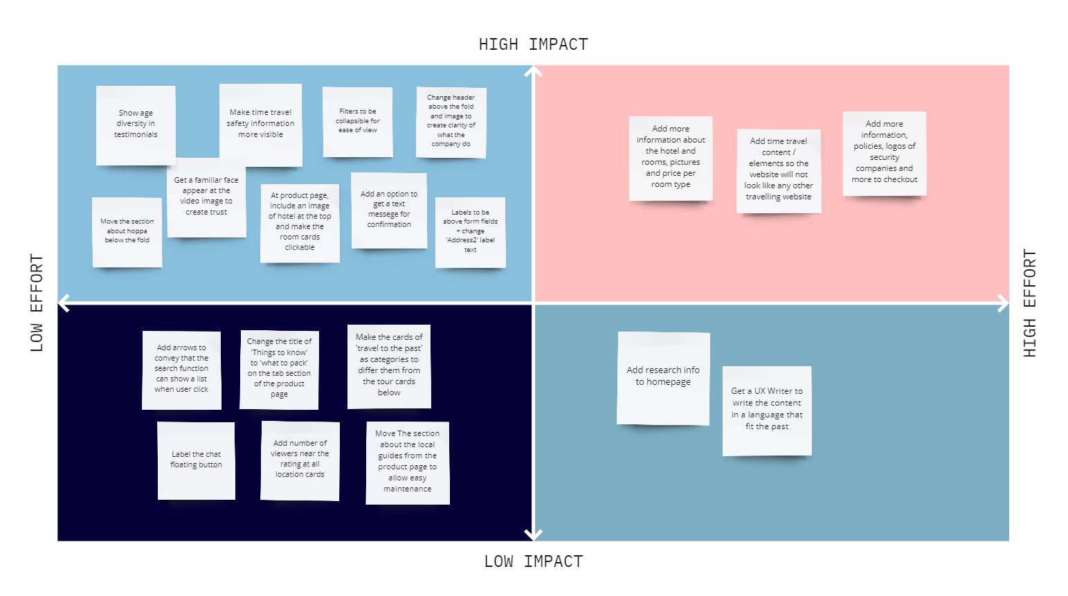
I have created an affinity map based on insights collected from evaluating user feedback and patterns identified in the usability tests. Based on the opportunities I’ve identified, I created a priority matrix to identify a few potential paths to take for my next iteration.
Iterate
I have made changes to the home page design based on my findings. The next step will be to implement the additional changes identified in the usability tests. Then conduct another round of testing. If there is more time, Interactive elements such as hover state can be added to the design to provide a better user experience.
The home page has a high impact on user experience and trust, therefore I have decided to prioritized the important elements and redesigned it, by implementing the following changes:
I have changed the look and feel to ensure that it is more obvious for the users that we are selling packages for time travel, which differs from other travelling websites.
To gain users trust, I have brought the section about time travel forward on the homepage, included a familiar face to the video explaining how time travel works, changed the copy and made the secondary button more visible for users to find out more information about safety.
Changes to cards containing package images, to help users differ between travel categories and experiences users can book.
In the reviews section, I’ve created more age diversity to appeal to all age ranges.
Reflection
I chose this project because around that time I’ve been watching Dark and DC's Legends of Tomorrow, both on the concept of time travel with the latter specifically taking you to historic events in time.
Choosing to work on a fictitious project was challenging in terms of research. It was difficult to find users who are already familiar with the service as well as analyse potential competitors.
I soon learned that asking the right questions is essential for designing a successful product. Without gaining a depth understanding of the issues users phase, we cant move forward with finding the right solution. It is also important to identify the why behind their behaviour.
If I had to do this project again, I would choose to observe users while they go through the booking process on similar websites as well as conduct quantitative research to further understand and uncover the pain points. Also, I would have chosen to conduct a closed card-sorting instead of open, as it was challenging to identify a solid pattern to then use to categorize historic events.
Overall, I have enjoyed working on this project. I gained an understanding of the challenges innovative companies and start-ups might face when they launch a brand new product.


